← Industrial design of the MacBook Air and the Thinkpad x120e. →
Somehow I find myself recently the owner of both a Thinkpad x120e and a MacBook Air. Since to me these two machines represent near-opposite approaches to the same problem, I thought it would be an interesting exercise to compare them. Specifically—because it is what interests me—I will be focusing on issues of industrial design, build quality, and human factors rather than performance. (On performance: the Macbook is very much faster, but then it cost more than twice as much. I ordered the x120e with less RAM and and a traditional hard drive; an SSD is an option, and its RAM can be configured to match that of the MacBook, which would give us a fairer comparison.)
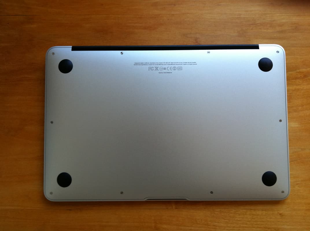
It is initially clear that the MacBook Air was designed to be a beautiful machine, and the Thinkpad (although not without a certain charm) was designed with other priorities in mind. Even the underside of the MacBook is “designed,” with thoughtful typesetting of the regulatory information, highly-polished screw heads, and sleek rubber dome feet:
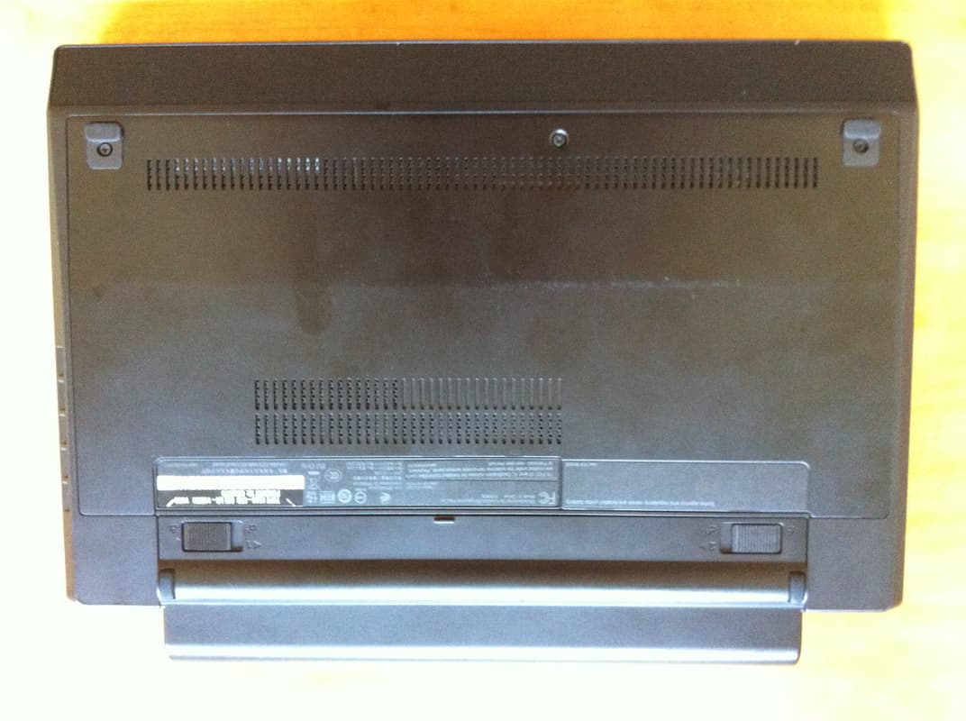
The underside of the Thinkpad is tidy but unexciting:
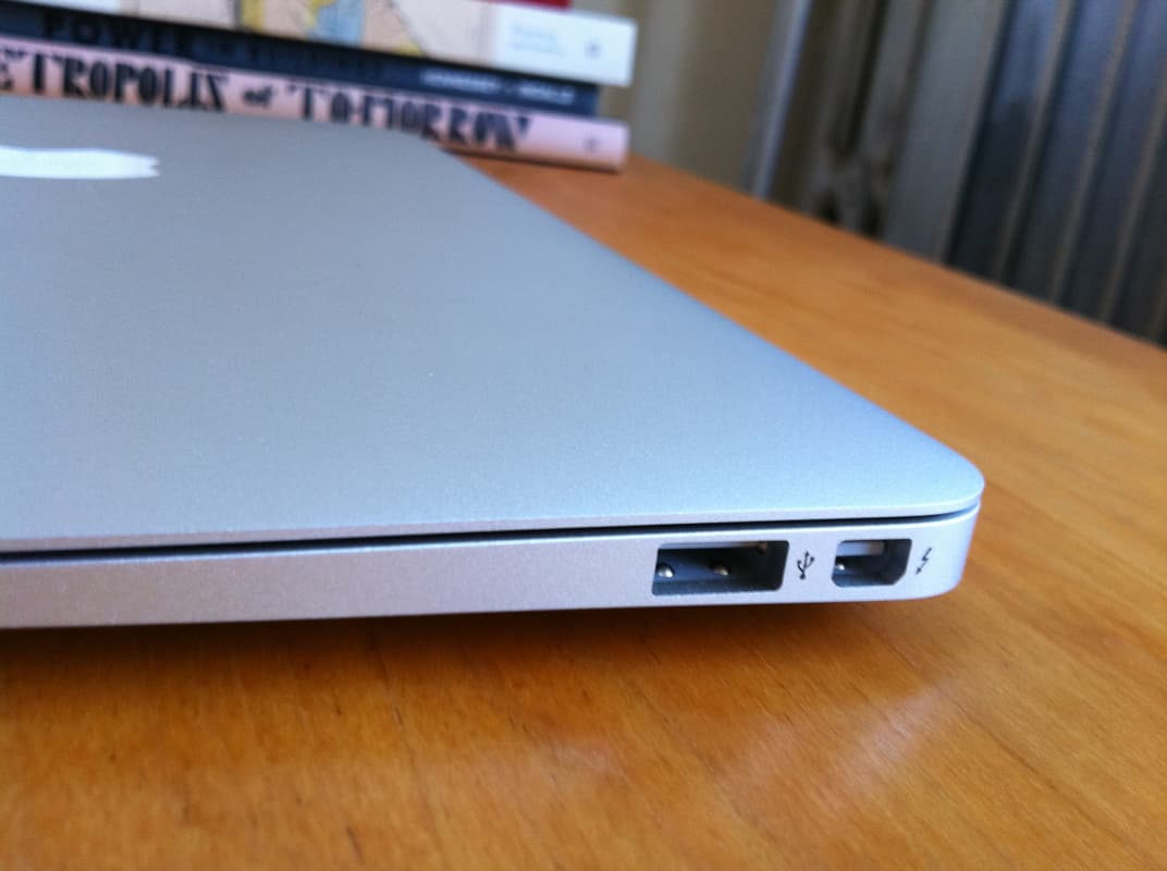
The MacBook is—as you will no doubt have tired of hearing by now—very, very thin:
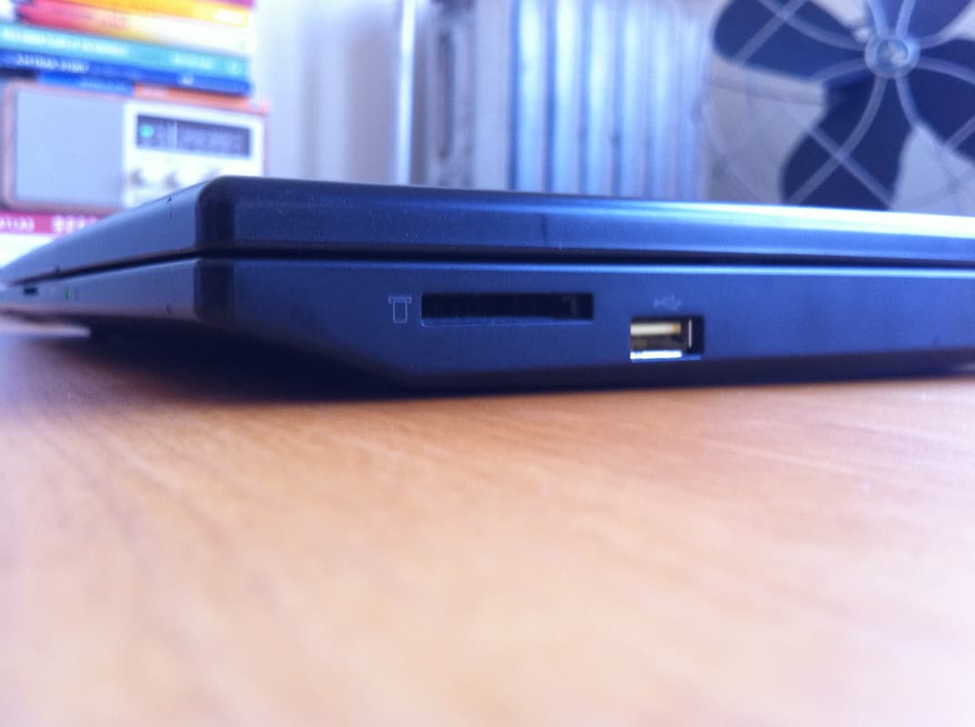
The ThinkPad is not:
But arguably the ThinkPad’s form factor is superior. Thinness has a high gee-whiz factor but does not seem to make the MacBook more portable. On the contrary, the MacBook is substantially longer in its longest dimension than the Thinkpad—11.6” vs 11.1”. It doesn’t sound like much but it really makes a difference in the kinds of kinds of spaces in which you can comfortably fit these computers. The Thinkpad nearly fits within the footprint of a standard 8.5” x 11” sheet of paper while the MacBook doesn’t. To my mind, in an ultraportable, you get the most additional versatility out of minimizing the size of the device along its longest dimension; Apple chose to focus on minimizing the shortest dimension, the least important, more as a show of engineering and design prowess than in service of any real user needs. This is all the more baffling since both laptops have a display with a 16:9 aspect ratio.
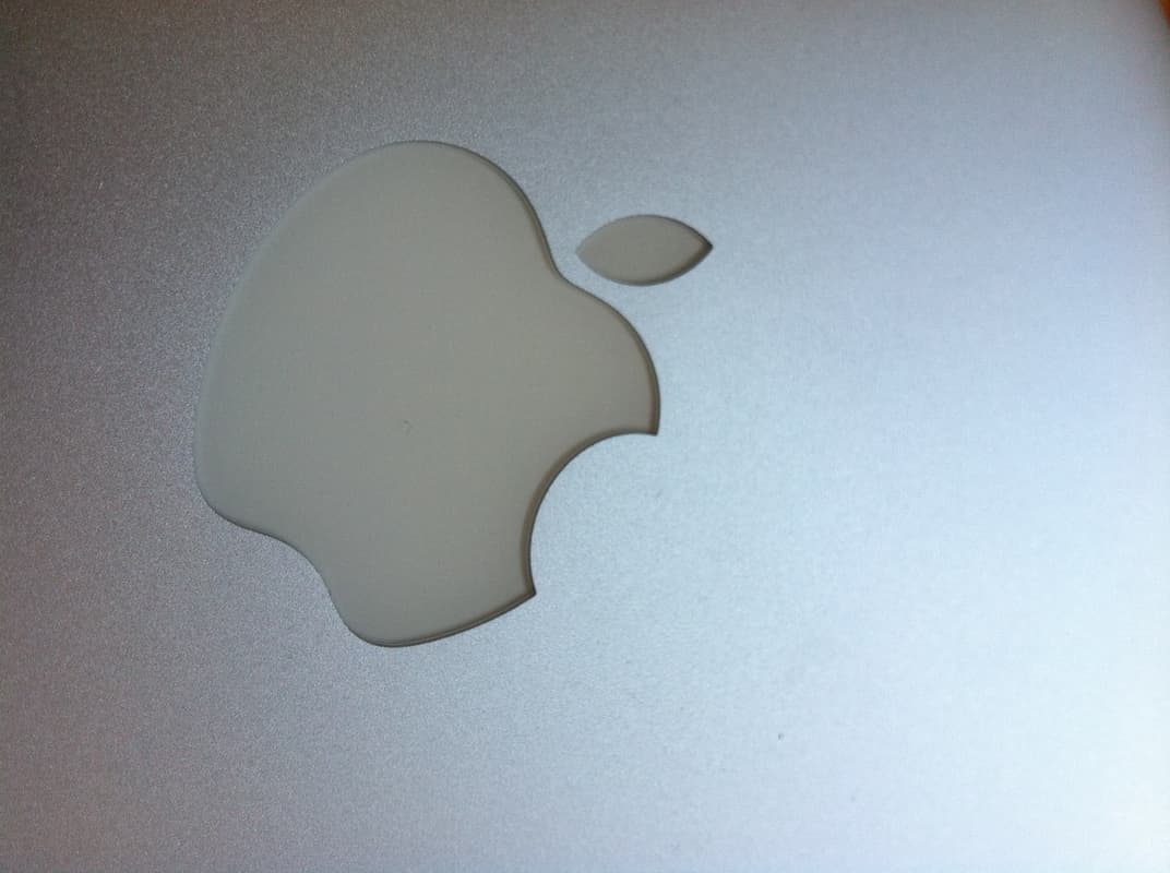
The MacBook’s aluminum body has a finish reminiscent of metal-flake automobile paint:
This is not especially to my taste (nor, to be honest, is the High 80s silver-and-black-and-polished-glass color scheme in general). This latest iteration of the Apple aesthetic makes me think it was designed to fit in at the clubs on Rush Street. I almost expect to see Patrick Nagel prints in the ads. The praise that Apple’s aesthetic decisions customarily receive is more reflective of the universally grim state of design among its competitors than of real excellence here. The striking thing about those comparisons between Apple’s (then-)current products and Braun’s products of the 1960s that were going around a couple years ago (e.g. Gizmodo’s and this one which was linked from Daring Fireball) isn’t how similar some of the designs are—it’s how chintzy the Apple products look when compared to the real thing.
But the body of the Thinkpad is no better. It’s simple flat black plastic. It is not very good or very interesting plastic. If I were going to change one thing about this machine, I’d add the rubberized coating that IBM and Lenovo have long used on most of the Thinkpad line, and which is still used on the other, more expensive, machines in the X-series line. It is immensely more attractive than this plain black plastic and it also makes the machine much easier to grip.
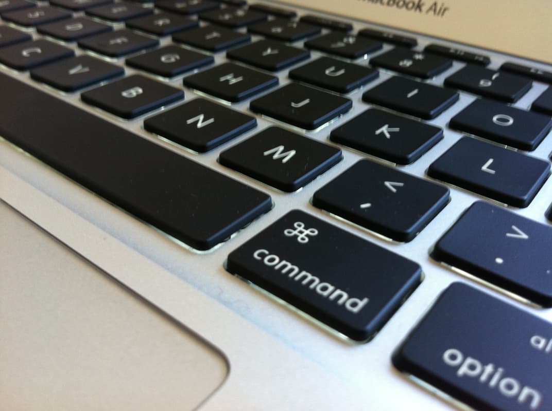
Let’s talk about the keyboards. The Mac’s:
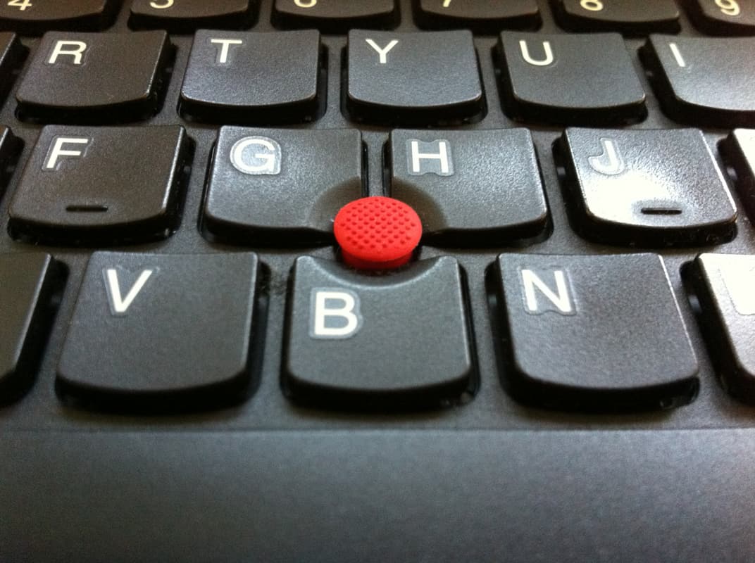
And the Thinkpad’s:
There’s no contest here. The MacBook’s keyboard is simply very bad. The keys feel like they are made of styrofoam. They rattle around. The key travel is brutally short. The keys do not move in a straight path when depressed—they lurch from side to side like it’s last call at a 4:00 am bar, probably because of the too-short key travel combined with the use of inferior keyswitches. The Thinkpad’s keyboard is very good, as Thinkpad keyboards tend to be. They’ve moved to a chiclet-style keyboard on the x120e (albeit with curved keycaps rather than the flat ones more commonly found on chicley keyboards) but they’ve retained the deep key travel and solid switches; in fact I prefer the x120e keyboard to even the old and beloved Thinkpad keyboards. Unlike most of my criticisms of the MacBook, this one is not a matter of taste or different design goals; it’s simply that Apple has used a cheap, shoddy, worse keyboard. Lenovo spent money making the keyboard work better and Apple spent money making it light up in the dark.
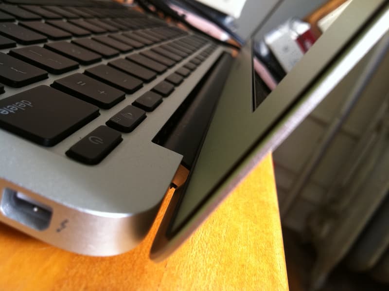
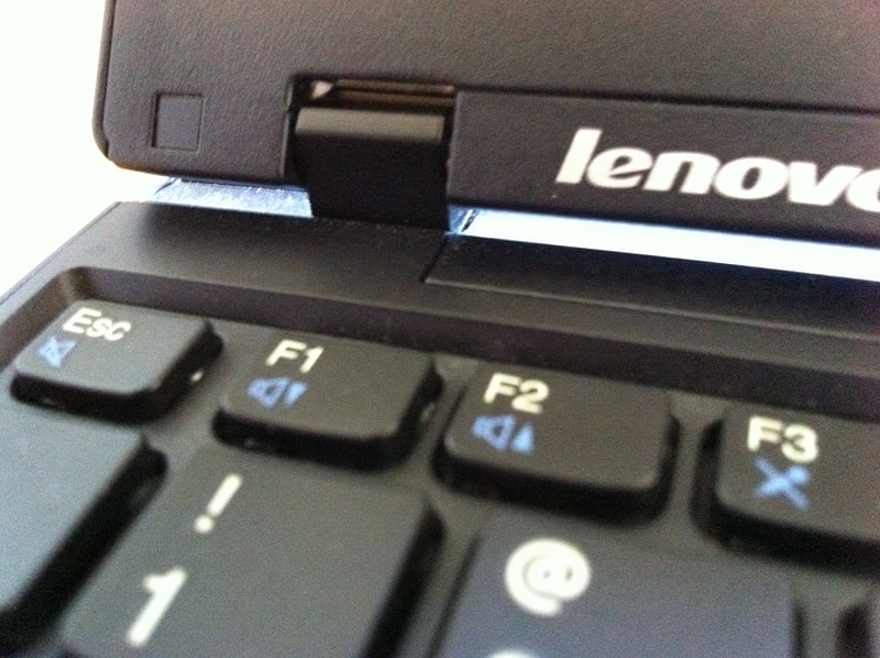
Both machines have pleasantly substantial hinge mechanisms:
The Mac’s glass trackpad has gotten a lot of praise, and there are some things to really like about it. The multitouch scrolling is delicious, and while I don’t find myself using pinch-to-zoom very much, it’s a nice feature. Unfortunately, the design of the trackpad makes it deeply frustrating to click.
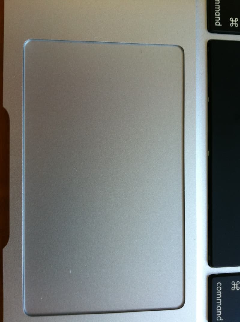
Although Apple advertising says “Press anywhere to click,” the trackpad is actually hinged along the top edge, so it takes the least force to click at the bottom edge and progressively more force as you move toward the top. I personally can’t click at all nearer than about half an inch from the top edge. It’s really only the bottom half of the trackpad that is as easy to click as a typical trackpad or mouse button on a non-Apple machine. This is deeply frustrating both because the top edge of the trackpad is where I naturally find myself trying to click (probably because it is the only part that is easy to reach without moving your hands entirely off the home row) and because there are absolutely no affordances to tell you where you can click and where you can’t:
It’s baffling to me that Apple would make this decision. If it’s not possible to make a trackpad that can truly be clicked anywhere, why not put the hinge along the bottom edge? This problem can be mitigated somewhat by enabling tap-to-click in the computer’s settings (it is off by default), which causes the trackpad to register taps as clicks like an iPhone’s display does—but, inexplicably (and unlike the iPhone), even with tap-to-click enabled it is impossible to drag items without physically clicking the trackpad.
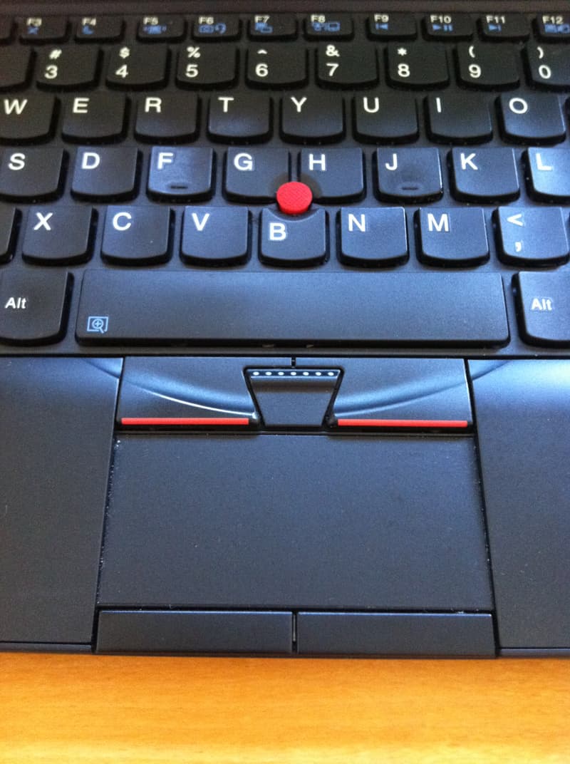
The Thinkpad, as one would expect, possesses a trackpoint, that god among pointing devices. Unfortunately its designers had a failure of nerve and shoehorned in an ugly, crowded trackpad complete with a second set of buttons:
It’s much too close to the keyboard and too easy to accidentally brush with your thumbs to be usable, and is best disabled. (It’s also, as you can tell from the photograph, a dust trap.) The smallest X-series laptops have traditionally shipped by default with only a trackpoint, not a trackpad; it’s too bad that Lenovo changed that here. There is no reason to cater to people who do not prefer the trackpoint since they are so clearly mistaken.
You can probably tell that I prefer the Thinkpad. Its screen is disastrously inferior to the MacBook’s lovely IPS panel (although it gets points for its matte finish), its body is constructed cheaply of cheap materials, its edges and underside are cluttered—but it is still the more humane design in a hundred little details. But the MacBook feels like it is from the future—which is certainly not a small thing at all.
